
OVERVIEW
WHOOP onboarding introduces new members to the app and guides them through setup in the first week. Because features depend on continuous real-time data, it takes 1–7 days for the system to calibrate. Many users didn’t understand this and thought the app is “broken”. To address this, I standardized the visual presentation of calibration and added clearer in-app education to explain the need for consistent wear and how WHOOP’s insights become more accurate over time.
My Role
Product Designer
Team
1 Product Manager
10 Developers
Design Timeline
1 month, 2025
BACKGROUND
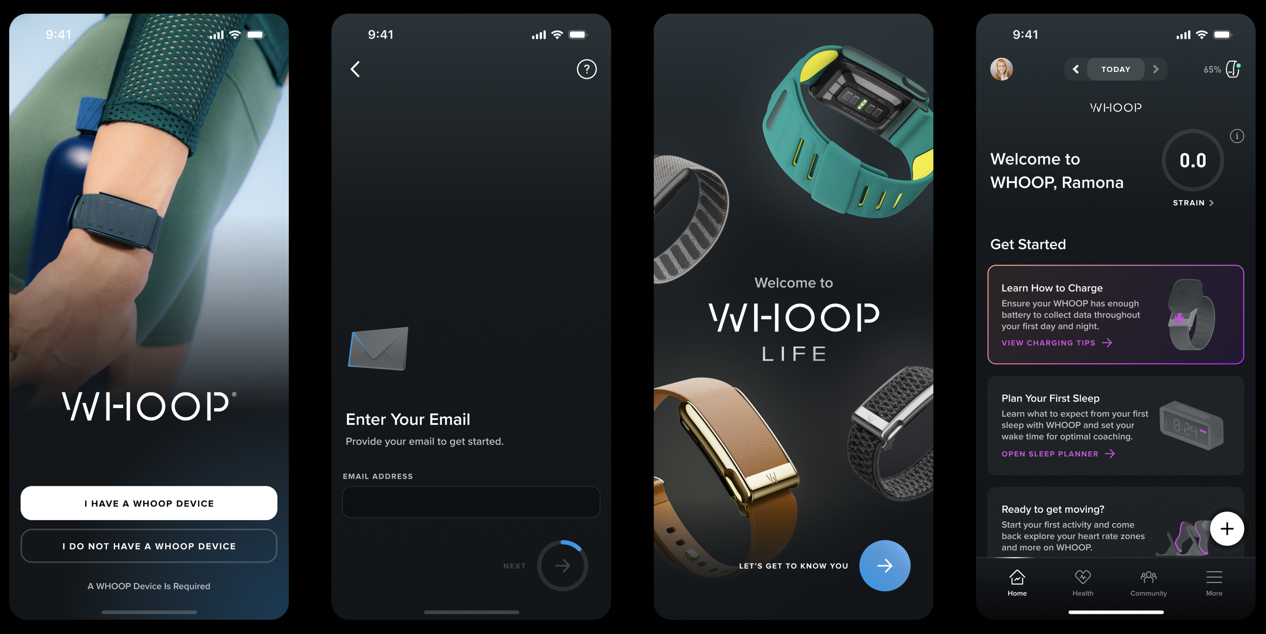
The WHOOP onboarding consists of a sign-up flow followed by a 7-day calibration period, during which most features gradually unlock as the system personalizes to the user.
To make the most out of the first 7-day experience, users should wear the WHOOP strap 24/7 so the app can continuously collect data. There are also a task-list for users to set up features such as “sleep planner”, “journal” to make the app more personalized.
PROBLEM
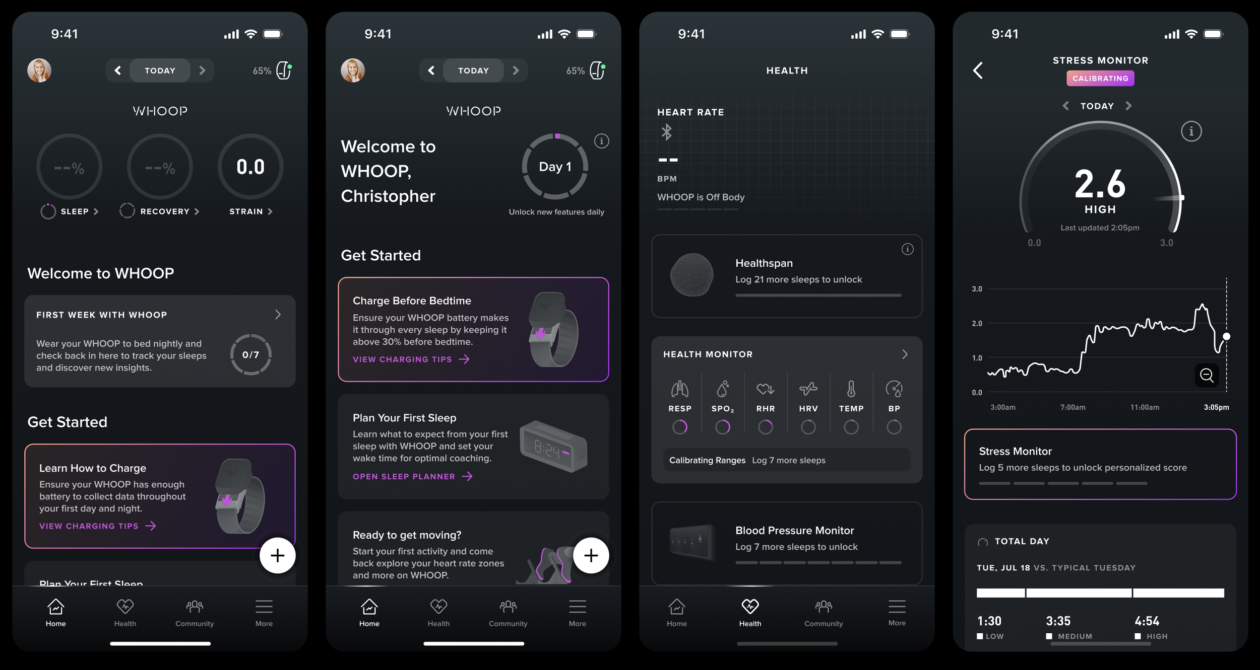
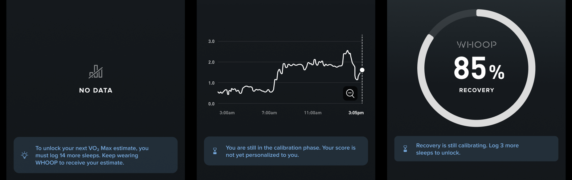
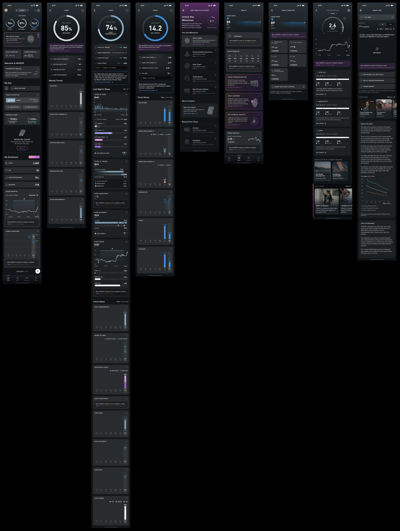
Calibration is shown in 7 different ways without clear expectations or a timeline, leaving new users confused about their progress.
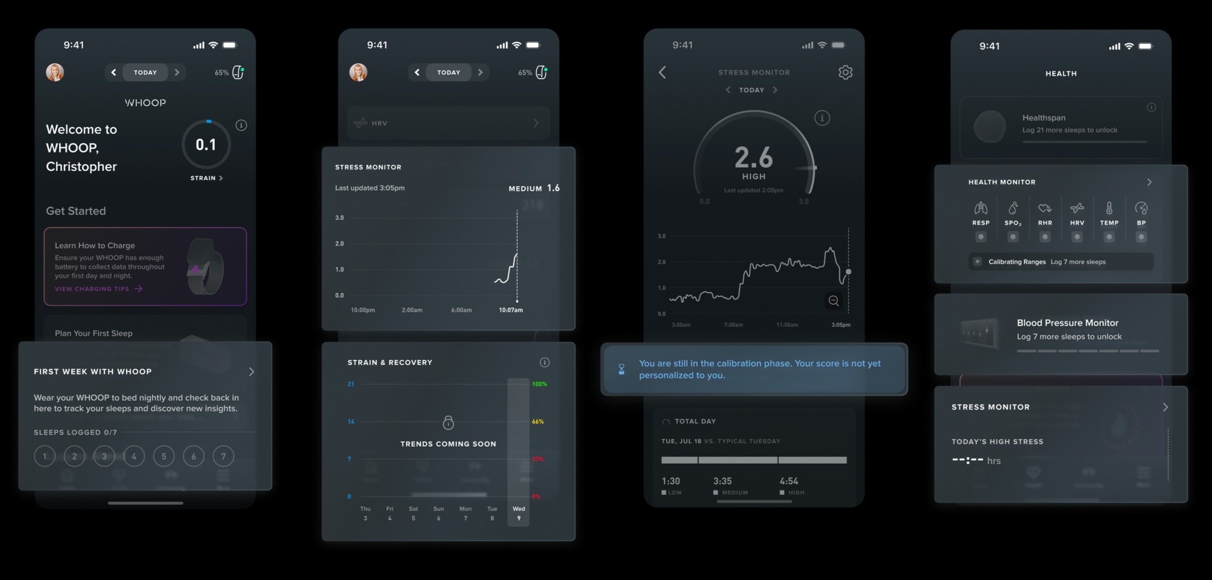
Copies such as “trends coming soon” or “You are still in the calibration phase” provide no clarity to first time users. The various designs representing calibration further add confusion and uncertainty to users who are not familiar with the app.
GOALS & METRICS
We aim to increase the number of members who achieve a 7 day perfect start (using WHOOP every day in their first week), which in turn boosts the Daily Active Member %.
Qualitatively, we aim to present the calibration state in a visually consistent and unified manner, while reinforcing the importance of wearing WHOOP 24/7. This includes a more comprehensive calibration timeline view and clear reminders that communicate what is being updated and why continued device wear is essential for accurate insights.
SOLUTION OVERVIEW
I standardized calibration design across the whole app and added animation to explain how WHOOP works during the onboarding flow.
Timeline was tight, and I had to come up with an effective and technically feasible design plan to update the whole 1 - 7 day experience and send them through A/B testing. And here’s how I tackled it:
PAIN POINTS… AS A DESIGNER AND USER
First impression matters…a lot! How might we design the first week at WHOOP to feel clear, motivating, and truthful, even as key features are still calibrating?
User Pain Point:
We’ve observed that new users often lose motivation in their first week due to limited feature visibility and lack of instructions. Questions such as “what is calibration? Why are features calibrating? At what point will the app provide full functionality?” are unanswered during the onboarding experience.
My Pain Point as a Designer:
I discuss and use the WHOOP app everyday! It’s difficult for me to picture myself as a complete new user again – how can I design the first week experience with fresh eyes and mind?
DESIGN EXPLORATION
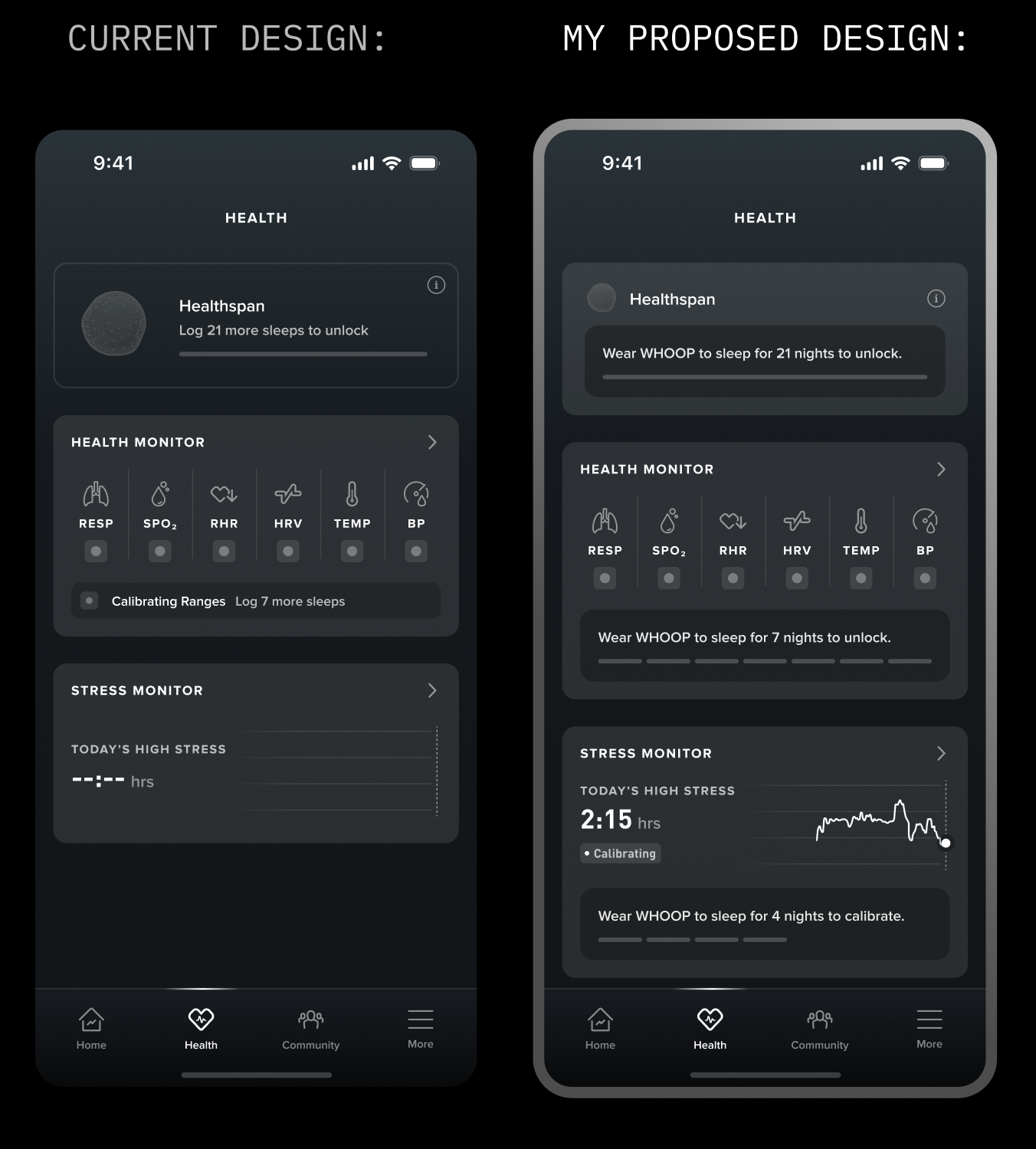
I started exploring existing design patterns to identify scalable ways to represent calibration consistently across the app.
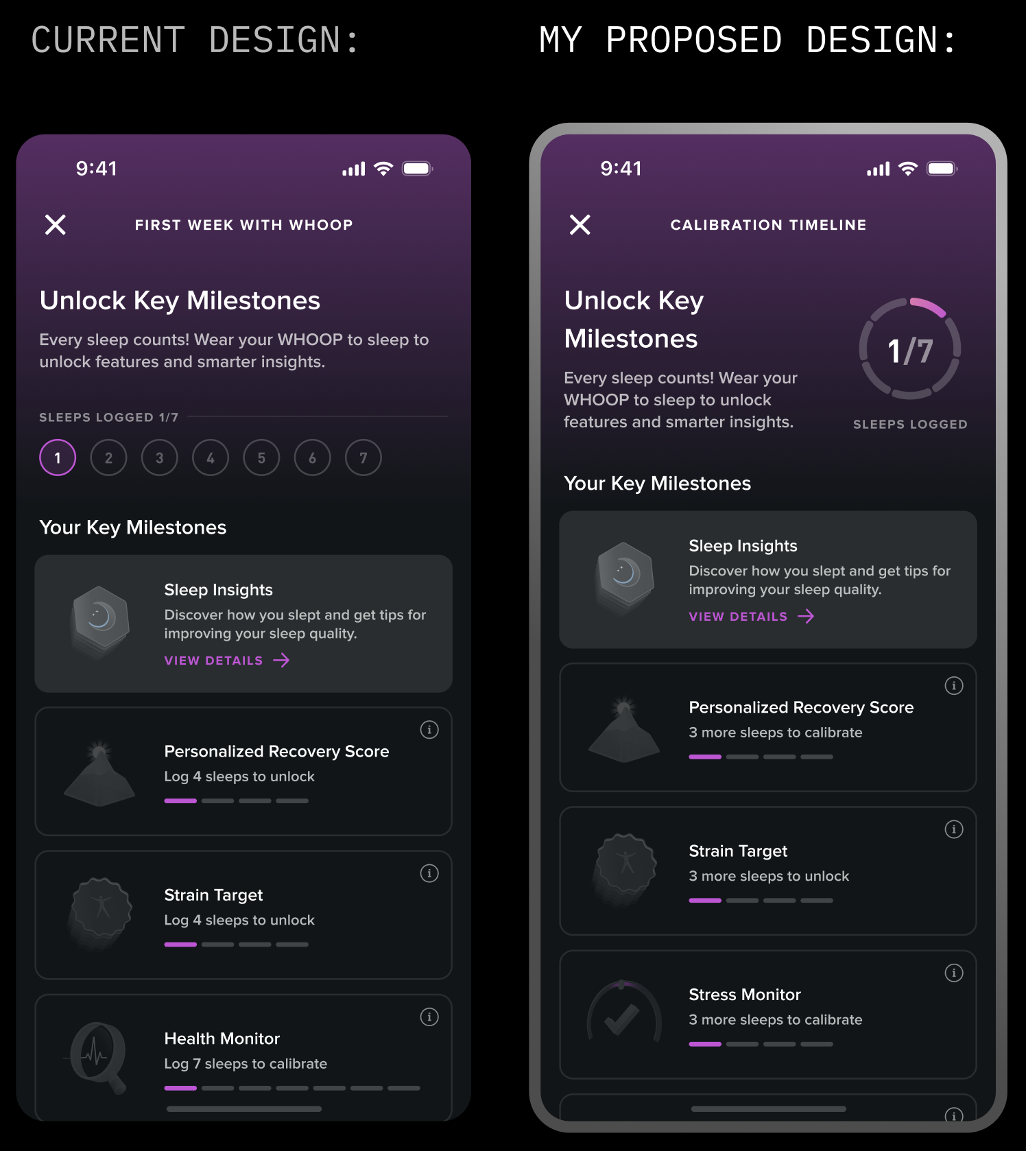
The recurring patterns I’ve seen in the app are the circular design and the dash design. I mocked examples using both designs, and realized that the circular design, when scaled small, couldn’t pass accessibility standards. The dash design, on the other hand, is already commonly used in “Unlock Key Milestones” page to represent calibration.
Existing design patterns:
My early concepts:
MY APPROACH
Through further exploration of design concepts, I developed a set of guiding principles to help standardize calibration and make it more intuitive for users.
1. Maintain Structural Consistency throughout the app
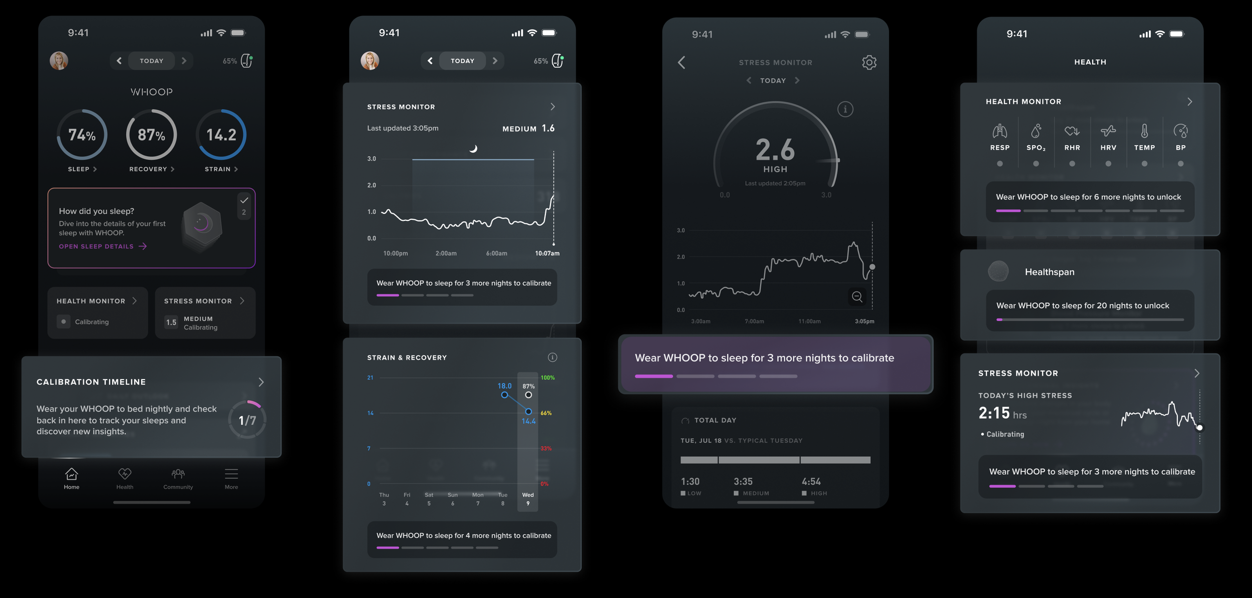
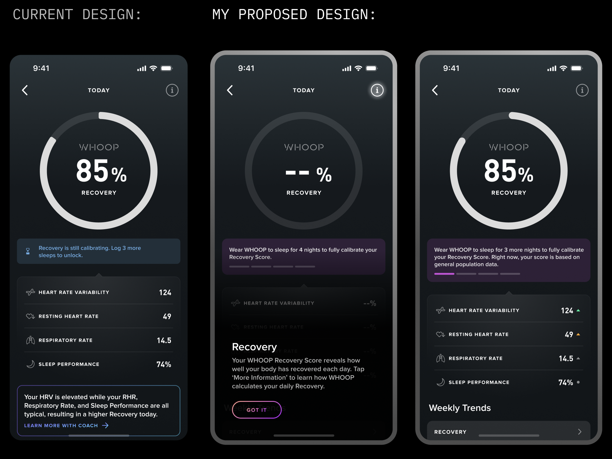
On Day 1, the WHOOP app hides the Recovery and Sleep gauges because baseline data is still being collected. However, this can lead to confusion, as new users often explore key features early on—and the absence of WHOOP’s signature “3 gauges” makes the experience feel incomplete.
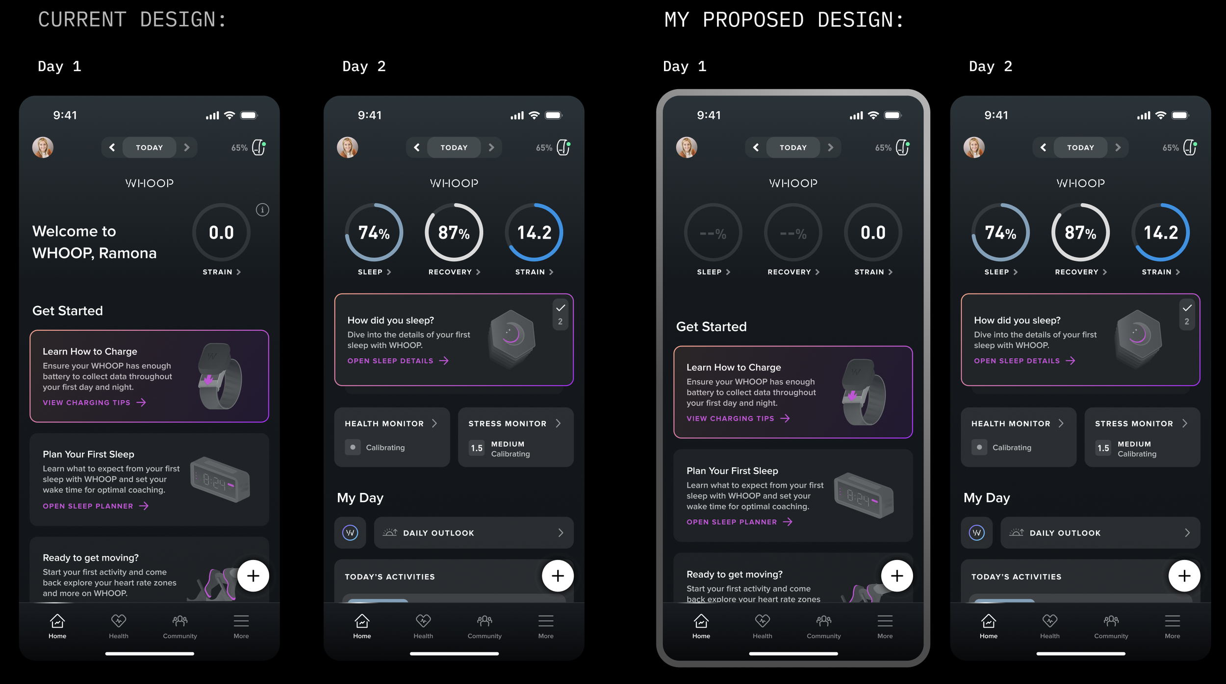
This is a major change in the onboarding design as the Day 1 experience has traditionally only featured a single gauge. One question that I got is: Now that we’re surfacing the two previously unavailable "calibrating" gauges on Day 1, what should users see when they tap into each one?
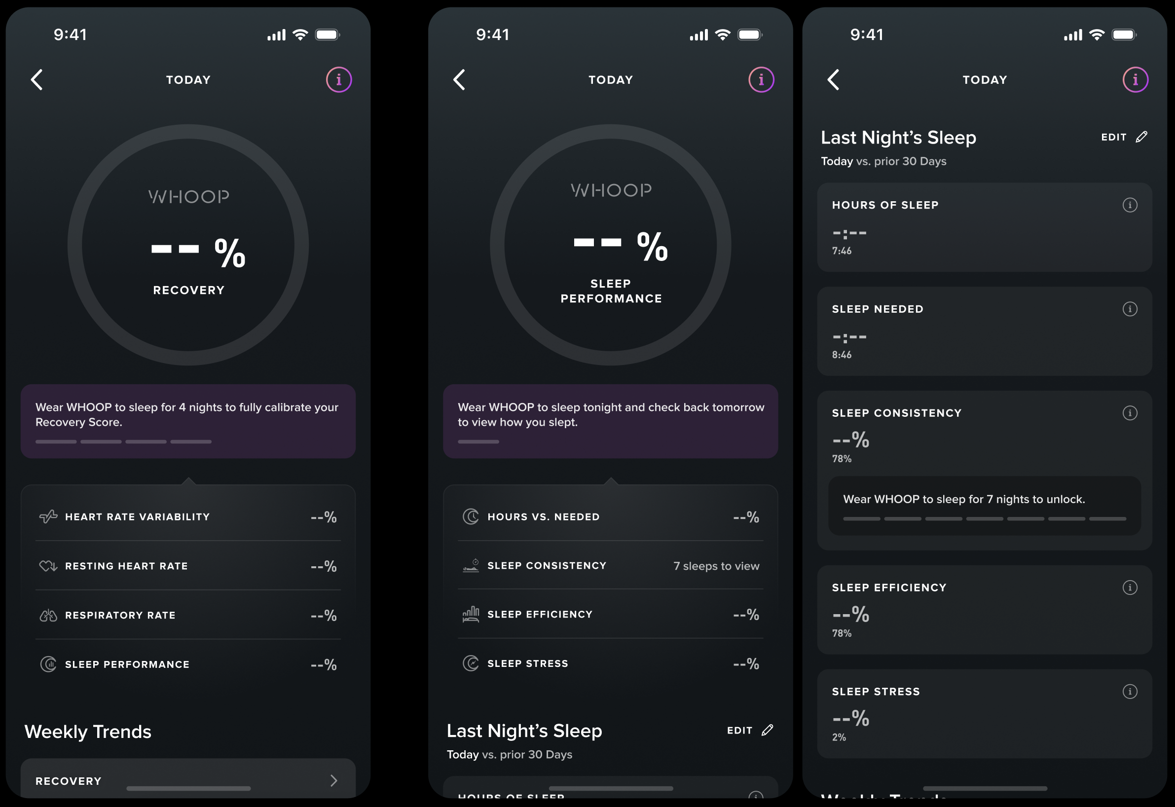
My answer: The blank states, BUT with clear education on how calibration works. I want users to envision the full value of the app from the start. Thus, I stated clearly how many sleeps users need to calibrate each gauge/score and I highlighted the “info” icon that contains how WHOOP works.
2. Calibration should follow a countdown-style experience, using a consistent timeline design throughout
I found the dash, timeline-like design more scalable and applicable, thus I started applying the same calibration design to features across the app.
3. Avoid ambiguous wording and set up clear expectation
Calibration-related copy in the app also lacks consistency, and some phrasing can be confusing—for example, “log 3 more sleeps.” Since WHOOP automatically detects sleep through wear, the term “log” may imply manual input, which misrepresents the actual user experience. I was looking to standardize all the copies and add more accuracy to their meanings.
Current copies are varied:
We want to use natural language as much as possible, but also set up a systematic approach to copies regarding calibration, for example:
On users’ first day in the app:
Say “x nights” instead of “x more nights” since they haven’t worn it to sleep at all yet
When users are 1 sleep away from full calibration:
Say “wear WHOOP to sleep tonight” instead of “wear WHOOP to sleep for one more night”
Regarding sleep:
Say “wear WHOOP to sleep for x nights ” instead of “log x more sleeps to unlock”
Regarding icons:
Avoid using icons that don’t add additional meaning
4. Education! Tell users the whole picture and the “why”
Why do users need to wear WHOOP 24/7? Currently, we tell users to wear it constantly, but we never explicitly explained to them “why” during the onboarding flow. During user interviews, we realized that many of them don’t understand the relationship among the three gauges.
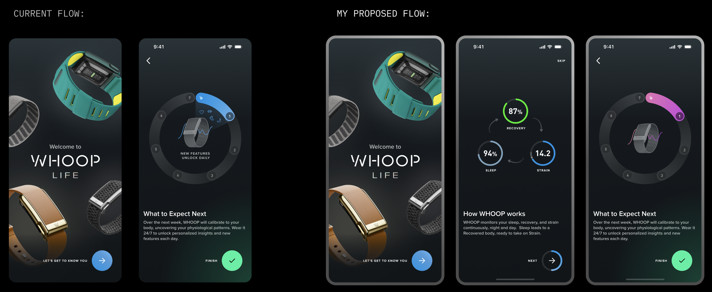
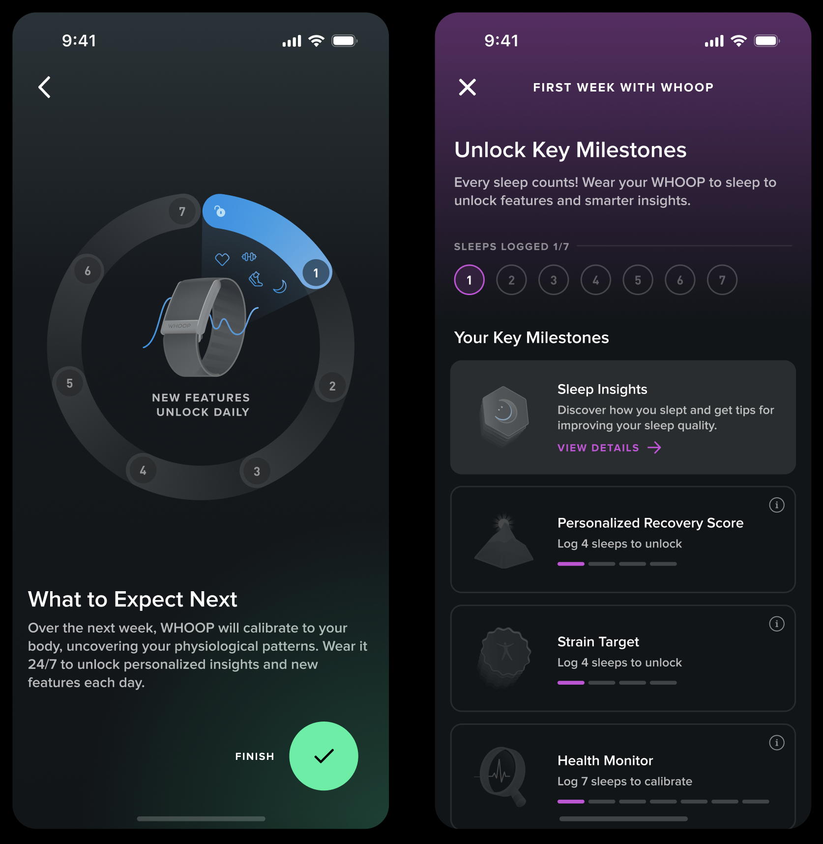
I added two animations into the onboarding flow, because they can illustrate well how the three gauges work and how new features unlock to give users the whole picture.
I showcased three scenarios of how good, mediocre, and bad sleeps influence recovery and strain to indicate that WHOOP provides personalized insight everyday. Thus, it reflects that users need to wear WHOOP to sleep since sleep is the foundation of all insights.
There’s currently a static illustration depicting the next seven days with WHOOP, but I’d like to animate it to more effectively convey the calibration timeline.
In line with Guiding Principle #2, I updated the “Unlock Key Milestones” visual to use a circular format for better alignment.
A HOLISTIC VIEW
After determining all the details, I mapped out how each screen looks everyday during the first week as a new user.
Sneak peek! Here’s how the app experience appears on Day 2:
WHAT’S NEXT
We’re breaking the calibration experience into a series of A/B tests to evaluate whether each design element improves the “7/7 Perfect Start” completion rate.
Based on the results from these A/B tests, we will determine the final design of calibration. During the same sprint, I also assisted the engineering team to perform several other A/B testings:
make credit card page “skippable” and building trust to improve onboarding drop-off rate
insert a live heart rate view after pairing device during onboarding to improve drop-off rate
experiment with different personalization task-list on Day 1 to boost engagement rate
REFLECTION
What’s obvious to us isn’t obvious to users.
As insiders, we carry an inherent bias. We can’t assume new users share our knowledge of the app. Even when we think that something is “obvious” to the users, we need to think again and really consider from their perspective. When they open WHOOP for the first time, it’s critical that we provide clear guidance, education, and context to help them engage confidently instead of playing the “guessing game”. This early clarity is foundational to building trust and driving strong engagement.
With this insight in mind, a question I’d explore further—if given more time—is: Do users actually understand what “calibration” means in the context of WHOOP?